Share A Story is a platform for people to practice mindfulness in the news they consume. A gamified social network, it encourages a user to share what they learnt and immediately see how reliable their source was.

Understanding the User
Staring with my client as a back-end developer, I integrated the AirTable database with an AI API, to automatically generate the values of each submission that a user would send. The current user personas we were working with were college students ages 18-23, with an interest in journalism. The database and interaction had currently lived on Slack and AirTable.
User Pain Points
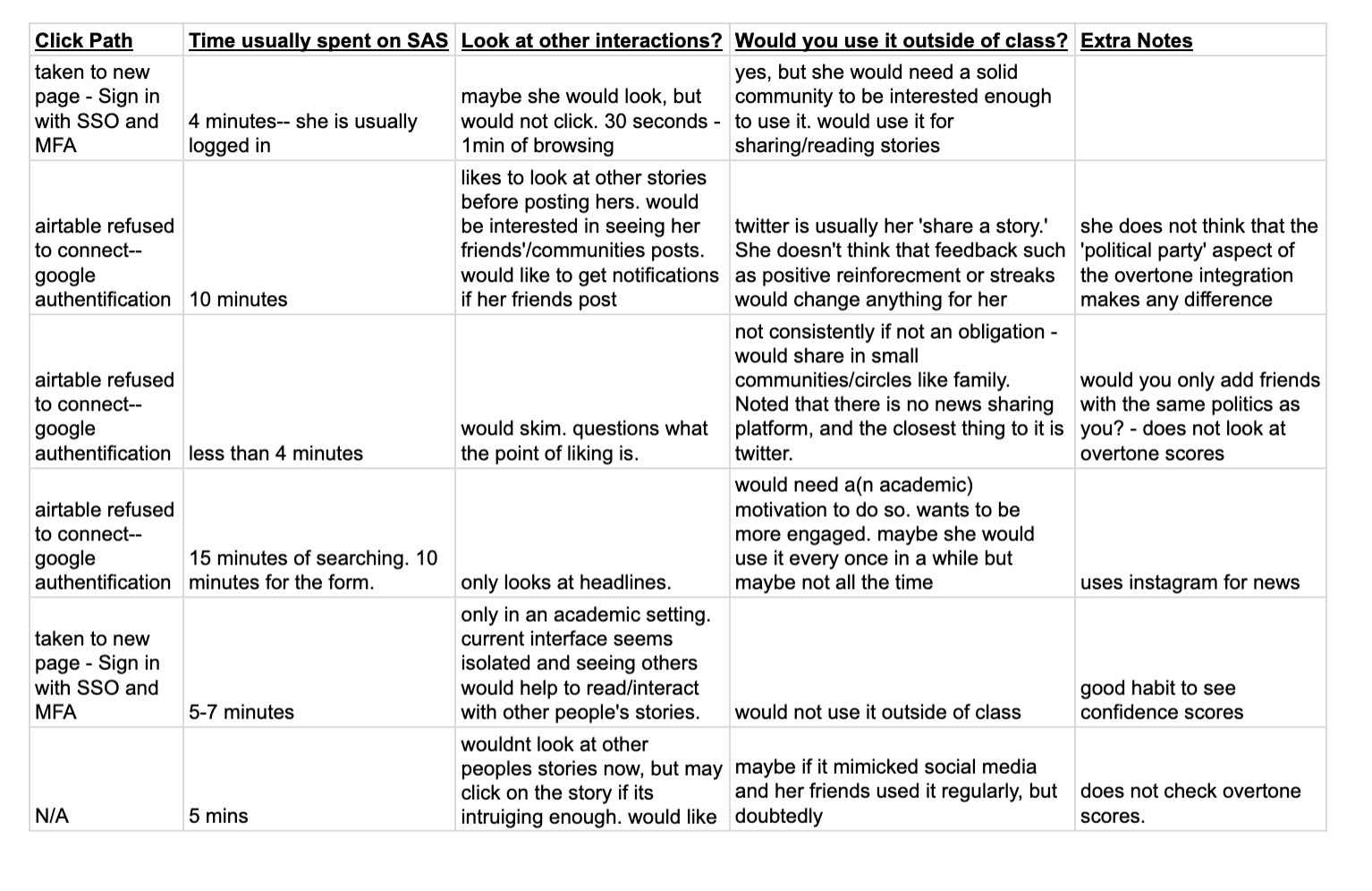
I conducted brief interviews with the students to gather insights. Using this information, I mapped out a customer journey with key pain points. The areas with low satisfaction that arose in my interviews became the areas with greatest opportunity for a design solution.
Story boarding
Identifying challenges in book discovery, including personalized recommendations and community engagement, led me to explore potential solutions. To ideate, I storyboarded different concepts to inspire creativity and envision the final experience.

Paper Wireframes
Starting from low-fidelity prototypes allowed me to get feedback on the data flow and information architecture. I experimented with different iterations of each screen to find the most desirable design.


Digital Lo-fidelity prototype
After a brief round of user testing, I moved to digital wireframes.


In user testing with mid-fidelity screens, it was clear that potential users wanted more communtiy and engagement with peers. In addition, 60% of users mentioned that they would like more encouragement and progress bars.
Digital Mid-Fidelity Prototypes
After another brief round of user testing, I moved on to a mid-fidelity digital prototype.


Research Results